A Colorful Journey
Meet Chloe, a budding interior designer with a passion for transforming spaces through color. However, like many others, she often found herself falling into common color pitfalls that affected the overall aesthetic of her projects. This narrative will follow Chloe’s journey as she learns to master the art of choosing color palettes, offering you professional insights and solutions to common color mistakes.
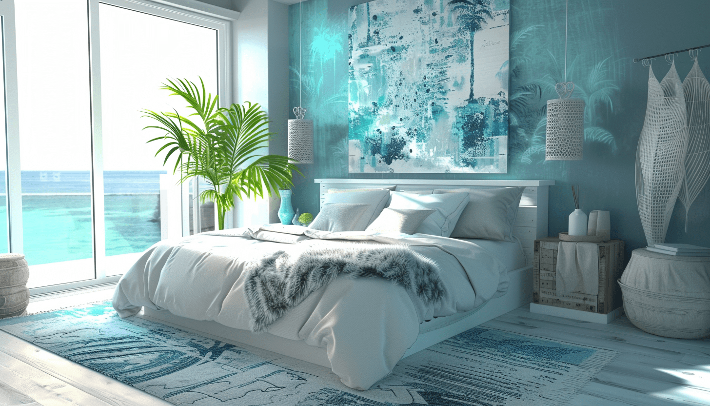
Overlooking the Psychological Impact
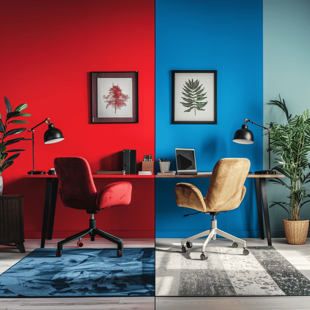
Chloe’s Challenge: Chloe was excited to revamp a client’s home office but chose a vibrant red, not considering the psychological effect. The client found the color too aggressive, impacting productivity.
Professional Insight: Colors profoundly impact mood and behavior. Red, often associated with energy and aggression, might not be suitable for a space meant for focus and calm.
Solution: Chloe learned to consider the purpose of the room and opted for blues and greens, which are known to enhance productivity and tranquility.
Ignoring Natural Light
Chloe’s Oversight: In her next project, Chloe chose a beautiful shade of gray for a north-facing room. However, the lack of natural sunlight made the room appear cold and unwelcoming.
Professional Insight: Natural light should dictate color choice. Light colors don’t just brighten a dark room; they make it feel larger and more open.
Solution: Chloe switched to warmer tones and added mirrors to reflect the scarce natural light, transforming the room into a cozy, inviting space.
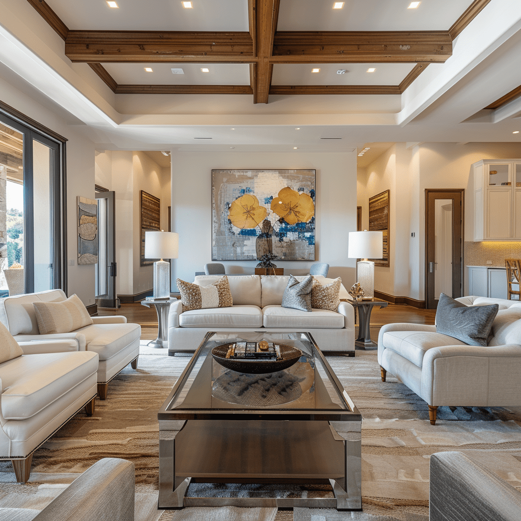
Playing It Too Safe
Chloe’s Safe Play: Fearing criticism, Chloe often defaulted to neutral colors. While the results were satisfactory, they lacked personality and impact.
Professional Insight: While neutrals are safe, incorporating bold colors can add depth and character to a space.
Solution: Chloe began experimenting with accent walls, bold accessories, and artwork to introduce color without overwhelming the space.
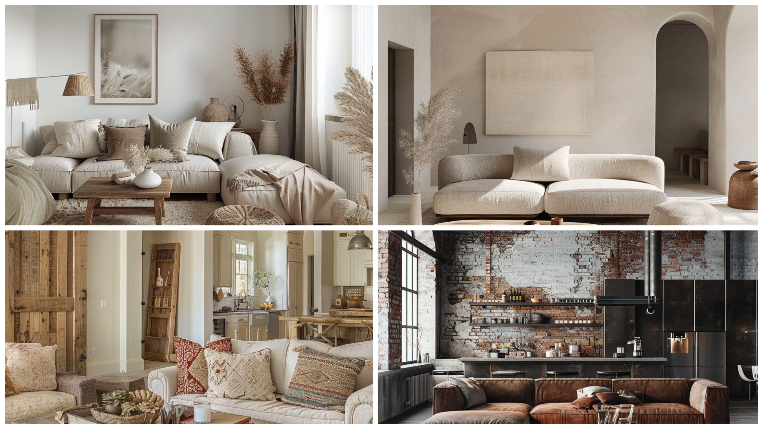
Disregarding Color Harmony
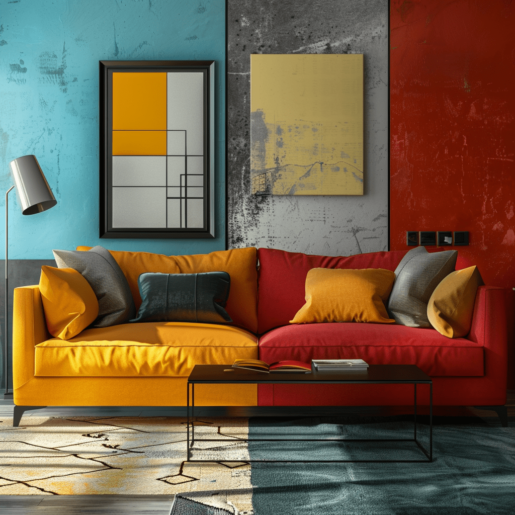
Chloe’s Mismatch: Excited by trends, Chloe once used multiple trendy colors together, resulting in a discordant and chaotic decor.
Professional Insight: Color harmony is crucial. Disparate colors can clash and disrupt the visual flow of a space.
Solution: Chloe learned to use the color wheel to find complementary and analogous colors, creating a harmonious and pleasing palette.
Neglecting the Finish
Chloe’s Finish Flaw: In an attempt to spice up a client’s kitchen, Chloe chose a high-gloss finish for all surfaces. The result was overwhelmingly shiny and impractical.
Professional Insight: Different finishes have different effects and practicalities. Matte can soften a space, while gloss can increase energy.
Solution: Chloe adopted a balanced approach, using matte finishes on larger surfaces and glossy finishes on smaller details.
Chloe’s Color Mastery
Through her trials and triumphs, Chloe transformed from a novice to a skilled color strategist, understanding that the perfect palette is about balance, context, and creativity. Her journey illustrates that with the right knowledge and a thoughtful approach, anyone can select colors like a pro, enhancing the beauty and functionality of any space.